1.Navigation: there are basic categories, but you can set the navigation to make it easier to find the content in each section. For example, the top project and blog may not be in the click in mode. Instead, put the mouse on the top and project 1-4 will appear below. You can click the corresponding article directly.

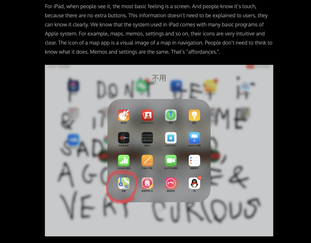
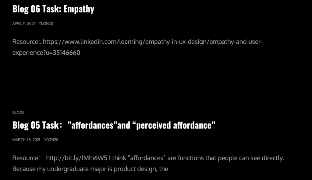
2.Content:The basic contents meet the requirements of each subject. However, in some articles, the relationship between pictures and words is not clear enough. You can add the relationship with the picture in the text, such as “as shown in the first picture,…”, or “we can see from the following picture…”. The picture should not only be a simple picture, but also let readers know what the picture is and what the meaning is. The second point is that the web pages in some blogs are not links that can be directly accessed. You need to copy and paste.


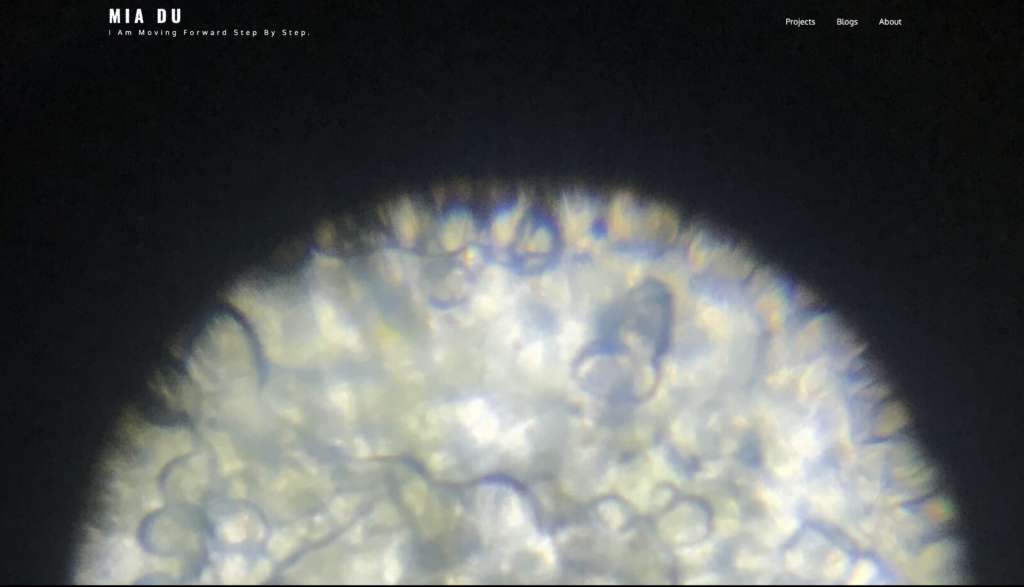
3.User experience: when clicking into the home page, there is a large background image, which occupies a large space. We can consider the use of this part of the space, whether we can adjust the visual effect of this part. Is it possible to make effective use of every space. Black background may be personal preference, but it can also be considered.

4.Effects on different devices: in addition to browsing the website on the computer, we also need to consider what it looks like on the mobile phone.
I have made some minor adjustments to the above problems, such as the background image, the association between the image and text in the blog, and I make sure that every URL link can be opened directly.